Logo
-
So I had a spare 30 minutes yesterday. Thoughts?
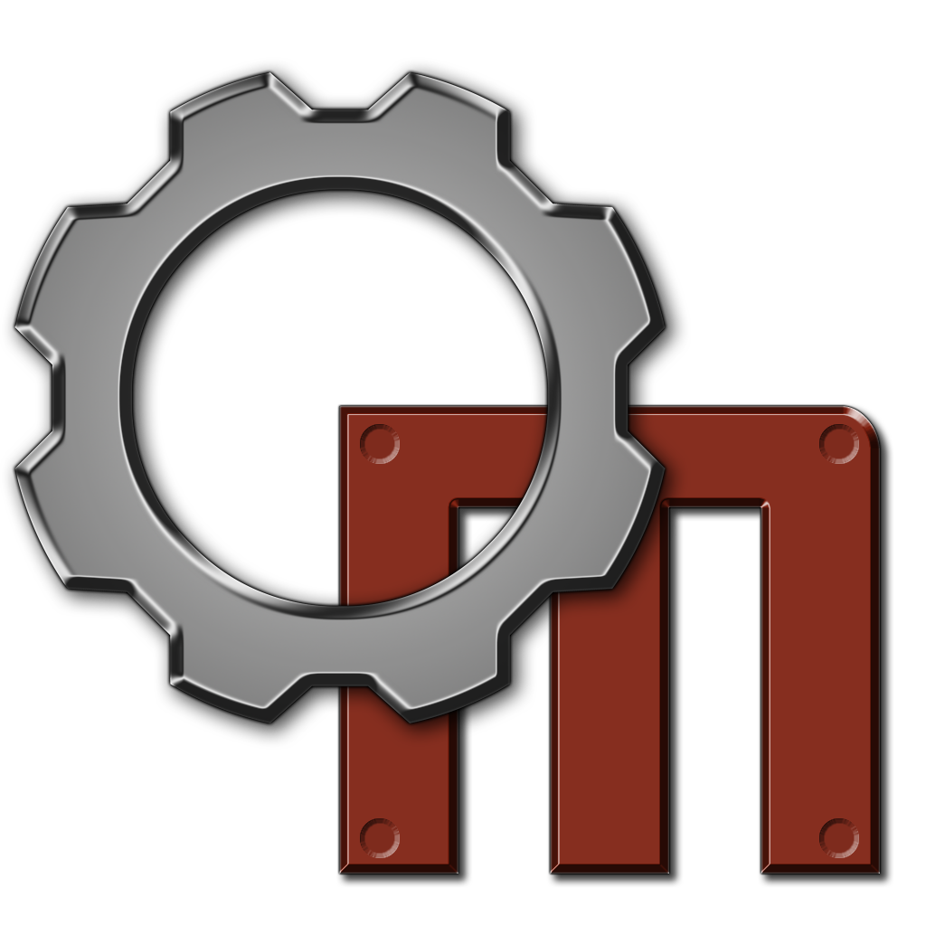
And with black Background:
-
This post is deleted! -
Definitely the one with transparent backgorund.
Yet, I still prefer a logo that resembles the original one, although a combination of both would be great (the gear could remain where it is and the m could be a machine's "face").
But, the one with transparent background is original , so I think something like that could be better. Maybe, the logo could be more like the soviet symbol, IBM, Intel, etc. (from a design perspective), to resemble a badge.
Also, it could resemble one of the machine's races' badge, or a pod.
These are just some ideas, but I like this approach/style! -
@Pisarz Well the black one is just to put it in perspective, the transparent one would be used. (most likely)
Yeah one of my initial problems with it was that it doesn't relate directly to the game other than with a mechanical aspect. Of course this was just a prototype, but in the future I'll probably try to do something incorporating the machines face.
-
I did these for the old forum 4 years ago.

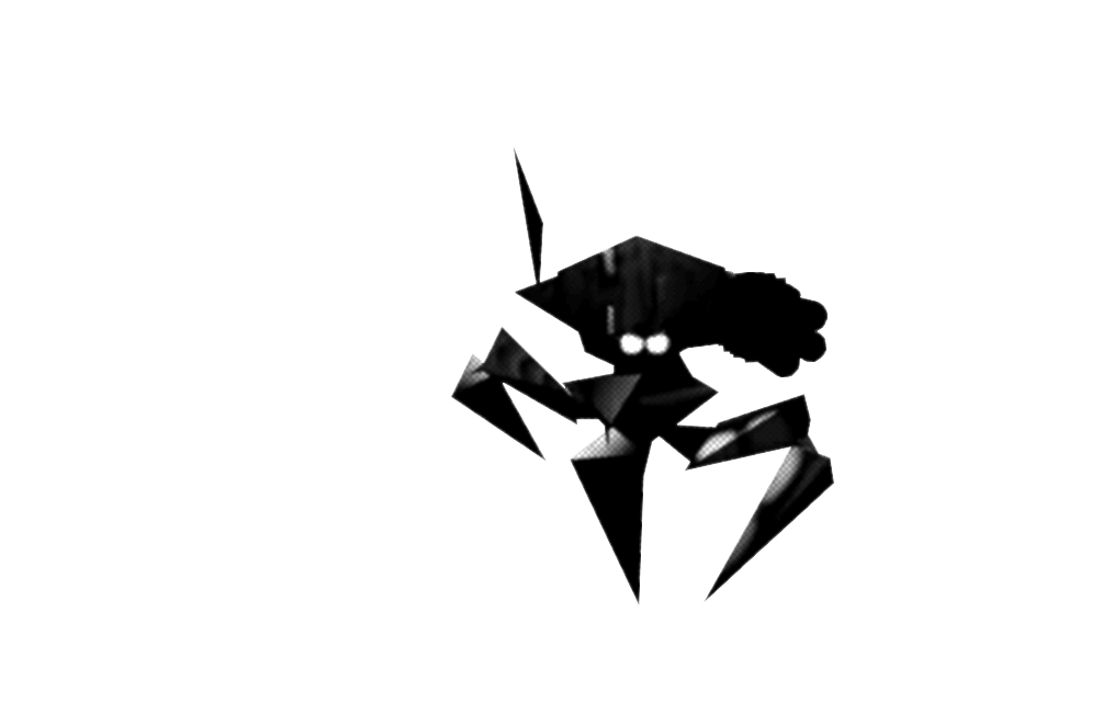
You can use them if you want :)
-
@Pisarz @bilal Maybe combine that gear logo with our fellow Autocannon Reaper? Maybe place it somewhere in the gear?
And that "M" might resemble Civilian/Military Lab!
...or make something that shows "Machines: Wired for War" was forgotten for once, but not for all. Like something associated with this game + insert a symbol here.
-

Using this one until I decide to fix the aliasing...
However I think the gear logo will be seen in some other places.
-
@bilal
Ok!
The gear logo could be used for modding or for a developers' section.
I did some things in trello. It looks nice!